Docs/Summer Upsell/FBT — Full Width

Product page widgets

FBT — Full Width

PDP

The FBT Full Width widget is the editorial cousin of Classic FBT. Instead of a vertical checklist, it spreads the recommended products across the full content width as a card carousel — closer to the way premium retailers show "shop the look" or "complete the set" recommendations.

Layout
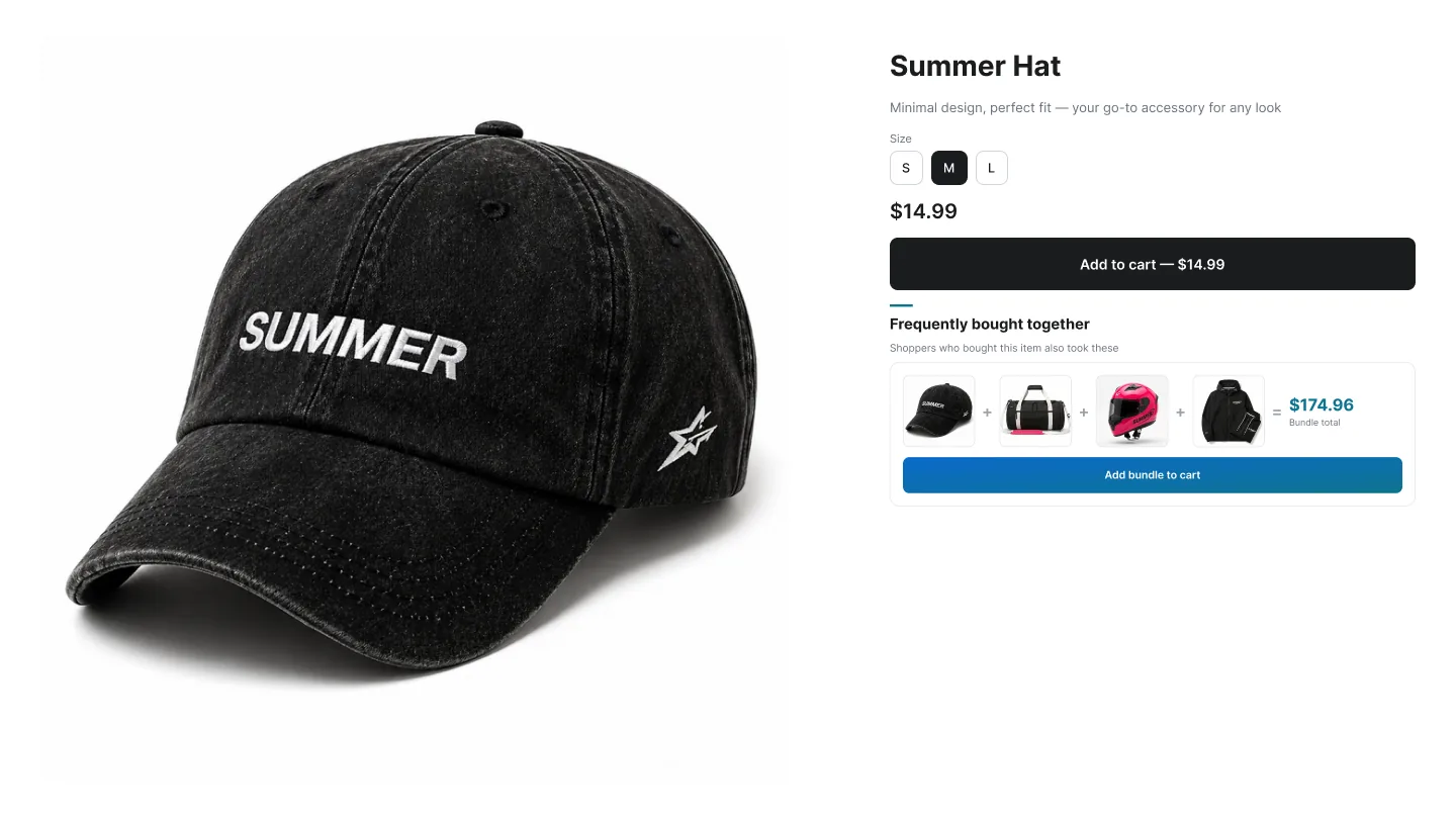
Full-width 'Frequently bought together' carousel below the product

Full-Width FBT

Premium retail

Title and subtitle on the left, arrows on the right, and a full-width carousel of product cards below — about 2.5 cards on phones and 4 on desktop. Each card has its own variant picker and Add to cart button.

  • Shows several products without pushing the shopper away from the buy button.
  • Arrows appear automatically when there are more products than visible cards.
  • Native-looking layout that feels like part of the product page, not an add-on.
  • Works with Shopify's related and complementary product lists via Automated recommendations.

Best for: Fashion, beauty, home decor — categories where 'shop the look' or 'complete the set' is a recognizable pattern.

How to create an FBT Full Width campaign

A

In the Summer Upsell admin

  1. 1 Click Create Campaign.
  2. 2 Under Frequently Bought Together on the Product Page list, pick Frequently Bought Together (Full Width).
  3. 3 Offer tab: name the campaign, set the Trigger, pick the Product source.
  4. 4 Add the products. The first 4 are visible on desktop without scrolling.
  5. 5 Optional: tick Enable discount for bundle products, set the Discount Display Title (e.g. Bundle savings), type and value.
  6. 6 Design tab: pick a template, set the Subtitle, tweak typography.
  7. 7 Language tab: set the Widget Title (e.g. Style the look) and Button Text, plus translations if needed.
  8. 8 Click Publish. The Test campaign in store checklist runs (campaign active, products available, app embed enabled, widget block added) — fix anything red, then click Publish campaign.
B

In the Shopify theme editor

  1. 1 Open Online Store → Themes → Customize.
  2. 2 Switch to the Products → Default product template.
  3. 3 Click Add block below the main product section.
  4. 4 Pick ✨ Summer: FBT FullWidth from the Apps section.
  5. 5 Drag to position — full-width layouts read best below the product description, before reviews / FAQs.
  6. 6 Click Save.
Field Type Description
Offer name Text Internal label only — used to find the campaign in the admin. Customers never see it.
Trigger Radio All products, Specific products (default) or Specific collections. Decides where the widget is eligible to render. Cart widgets use Any cart and Post-Purchase uses Any order instead of All products.
Trigger products / collections Picker Shown for the Specific options. Pick the products or collections that should fire the widget.
Product source Radio Specific products, Automated recommendations or Summer AI powered by ChatGPT (credit-based; every plan includes credits). See Upsell sources.
Offer products Picker Shown when Specific products is selected — click Add Products and pick the products the widget will recommend.
Discounts Dropdown No discount, Use Summer Upsell discount functions (Recommended), Use discounts that are dynamically created or Use an already existing discount code. See Discounts for how each mode works.
Type / Value Dropdown + number Product discount (each offer item) or Order discount (the whole order), and the amount as % or a fixed amount in your store currency.
Discount code Text Optional for Summer discount functions (creates a code-based discount the widget applies automatically); required for existing discount code.
Combination Checkboxes Whether the discount can combine with product, order and shipping discounts.

Design tab

Every campaign opens on the Offer tab. The Design tab next to it controls how the widget looks on the storefront. The same set of controls is reused across nearly every widget type, so once you learn it on one campaign the rest are familiar. A live preview on the right updates as you change settings — switch it between desktop, mobile and full size.

Field Type Description
Layout Dropdown Shown on widgets that have more than one layout (Cross-sell, Upsell, In-Cart Upsell, Product Add-on). Switches the layout without recreating the campaign.
Widget Title / Button Text Text Heading shown above the widget and the label on its Add buttons. For Classic FBT, Bundle, Popup, In-Cart Upsell, Cart Popup and Post-Purchase you set them here; for Upsell, Cross-sell, FBT Full Width and Product Add-on they live on the Language tab (default language block).
Subtitle Text Optional line under the title (e.g. Customers also bought these).
Templates Visual picker 27 ready-made themes: Modern Clean, Ink → Slate, Slate → Ocean, Espresso → Sunset, Blossom → Crimson, Teal → Ocean, Forest → Teal, Ocean → Glacier, Sunset → Crimson, Lilac → Denim, Cherry Blossom, Piggy Pink, Fresh Mint, Baby Blue, Sand, Lavender, Honey → Amber, Vanilla → Cream, Royal → Violet, Sunset Orange, Moonlit Asteroid, Amin, Celestial, Witching Hour, Frost, Quepal and Sublime Light. Picking a template sets the button style, card border and every color below at once — then fine-tune anything you want.
Background (optional) Toggle + color Give the widget its own background color instead of inheriting the page background.
Border Radius Dropdown Sharp (Square) or Curvy (Rounded) corners on cards and buttons.
Image Fit Dropdown Cover (crop to fill), Contain (fit inside, may show whitespace), Fill (stretch to fit).
Font family Dropdown Your Theme Font (inherits from your theme), Inter, Roboto, Montserrat, Poppins, Playfair Display, Libre Baskerville, Oswald, Plus Jakarta Sans.
Typography sizes Number (px) Title weight, Button font size, and individual sizes for Product Title, Price and Compare price. Set the compare size smaller than the price size for a clean strike-through look.
Colors Color picker Primary color, Product Title color, Price color and Compare price color. Override any single value after picking a template.

Tip: Click any template to seed every color at once, then nudge the individual swatches. Faster than building a palette from scratch.

Language tab

The Language tab holds the storefront copy for the widget. The Default language block is always there; click Add another language to add any locale your Shopify store has published and translate the title, button text and other storefront strings for it. Default text is pre-filled in English, Spanish, French, Arabic, Turkish and German. A locale you don't add falls back to the default language.

Tip: Image Fit = Cover gives this layout an editorial feel. Pair it with Curvy corners and your theme font for a native look.