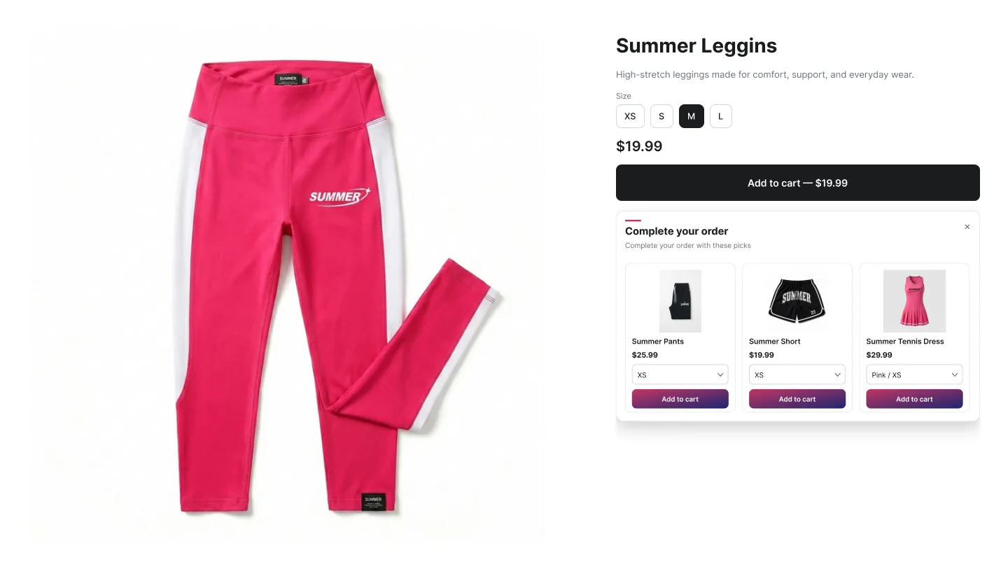
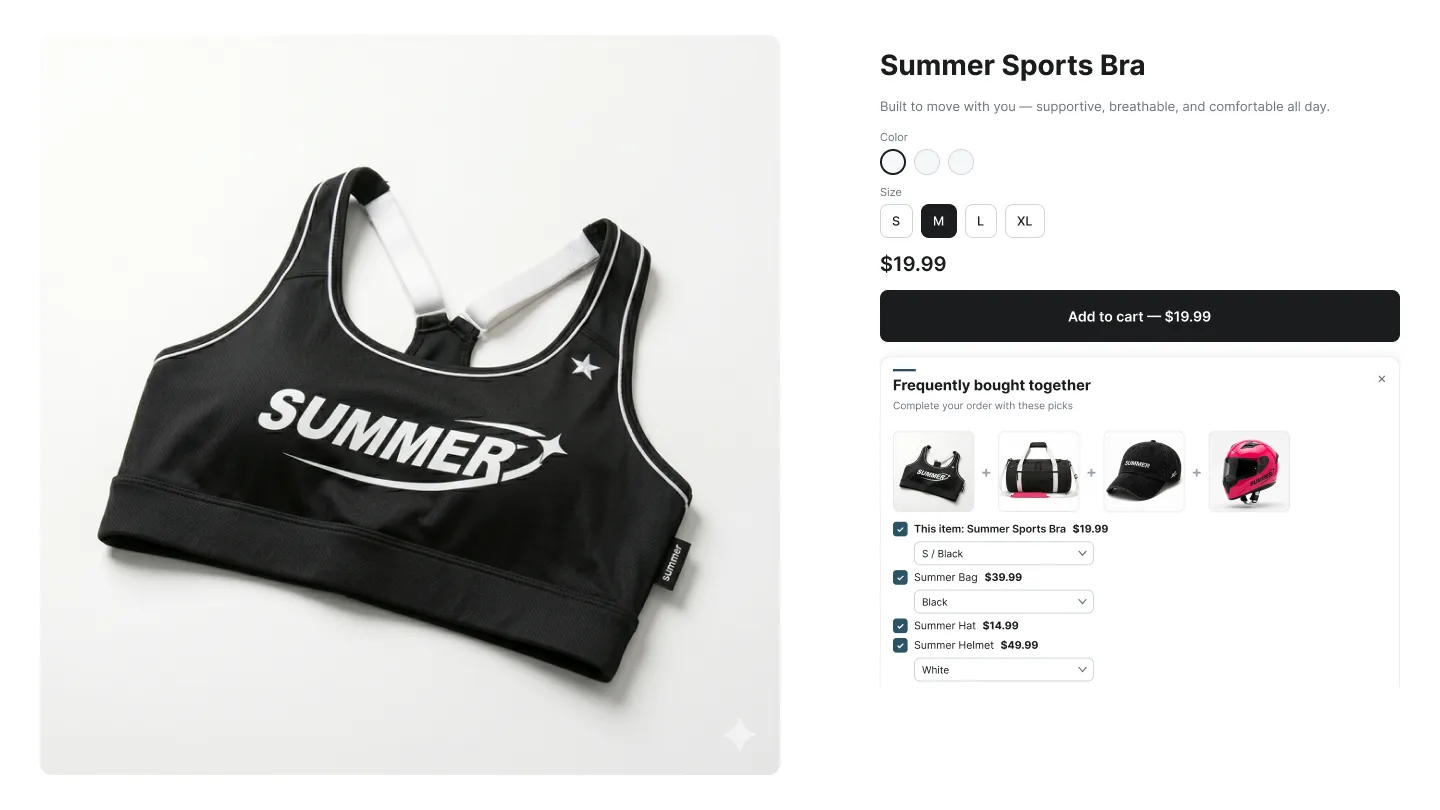
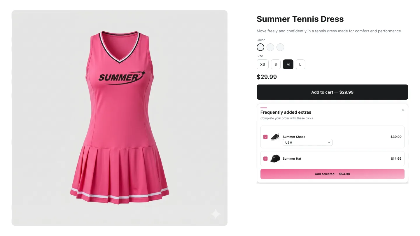
The Popup Upsell fires immediately after a customer adds a product to their cart from the product detail page. It catches them at peak buying intent — a few seconds before they move on — and offers a relevant follow-up purchase as a focused overlay.
Three layouts cover the three psychological angles: a single hero recommendation (Cross-sell), a curated mini-bundle (FBT), or a multi-select add-on list (Add-ons). Each fires from the same Add-to-Cart event but targets a different shopper mindset.
Layouts
Cross-sell Popup
Single product
Opens after Add-to-Cart with one recommended product and a clear Add button. Designed for low-friction acceptance — one decision, one click.
- Captures attention at peak buying intent — the moment after a successful Add-to-Cart.
- Picks one product at a time — minimal decision fatigue.
- Customer can dismiss without losing the cart.
Expected AOV impact: 5–12% AOV lift on add-to-cart events, with acceptance rates around 8–18% on relevant pairings.
Best for: Stores with a clear hero accessory or premium variant that pairs with most products (case for phones, premium edition for vinyl, gift box for jewelry).
FBT Popup
Bundle
Popup version of FBT — trigger product and recommended items shown together with checkboxes, a live total, and a single Add button.
- Bundle psychology in a focused overlay — no PDP layout changes needed.
- Live total updates as customer ticks boxes, with discount preview.
- Optional automatic bundle discount applied through Shopify Functions.
Expected AOV impact: 8–15% AOV lift on add-to-cart events.
Best for: Categories with strong complementary pairings (skincare routines, camera + lens + bag, kitchen appliances + accessories).
Add-ons Popup
Multi-select
Checkbox list of add-on products shown after Add-to-Cart — typically warranty, gift wrap, samples, expedited shipping. Multi-select with one click.
- Perfect for accessories, protection plans, and small-ticket extras.
- Multi-select via checkboxes — adds 2–3 items in a single click.
- Customer adds extras without leaving the page or revisiting the PDP.
Expected AOV impact: 6–14% AOV lift on add-to-cart events. Lower per-event acceptance than cross-sell, but high attach rate and incremental margin.
Best for: Hard goods, apparel, electronics — anywhere small extras (gift wrap, warranty, expedited shipping, samples) are commonly forgotten.
How to create a Popup campaign
A
In the Summer Upsell admin
-
1
Click + New campaign → Product Page.
-
2
Pick Popup Cross-sell, Popup FBT, or Popup Add-ons.
-
3
Offer tab: name, trigger products/collections, Upsell Source, upsell products.
-
4
Optional: enable discount.
-
5
Design tab: preset, Widget Title, Button Text. The popup uses the same color/typography controls as other widgets.
-
6
Languages tab if needed.
-
7
Save.
B
In the Shopify theme editor
-
1
Open Online Store → Themes → Customize.
-
2
Switch to the Products → Default product template.
-
3
Click Add block anywhere on the product section (position doesn't matter — the popup is fixed-position overlay).
-
4
Pick ✨ Summer: Popup Upsell from the Apps section.
-
5
Click Save. The popup will fire automatically the next time a customer adds a trigger product to cart.
| Field |
Type |
Description |
| Offer name |
Text |
Internal label only — used to find the campaign on the dashboard. Customers never see it. |
| Trigger Type |
Dropdown |
All Products, Specific Products, or Specific Collections. Picks where the widget is eligible to render. |
| Trigger products / collections |
Picker |
Shown when the trigger type is specific. Pick the products or collections that should fire the widget. |
| Upsell Source |
Dropdown |
Manual, Basic AI, or Summer AI. See the Upsell sources page for the full breakdown. |
| Upsell products |
Picker |
Shown when source = Manual. Pick the products that the widget will recommend. |
| Enable discount |
Toggle |
Turn on to add an automatic discount to the upsell. Configures a real Shopify Function discount under the hood. |
| Discount Type / Value |
Dropdown + number |
Percentage (%) or Fixed Amount ($). Value is the percentage or money amount. |
| When to apply? |
Dropdown |
Always (on selected products) or Only when trigger product is in cart. Use the second to prevent customers from buying the upsell alone with the discount. |
Design tab
Every campaign opens on the Offer tab. The Design tab next to it controls how the widget looks on the storefront. The same set of controls is reused across nearly every widget type, so once you learn it on one campaign the rest are familiar.
| Field |
Type |
Description |
| Widget Title |
Text |
Heading shown above the widget (e.g. You may also like, Frequently bought together). |
| Button Text |
Text |
Label on every Add / Add to cart button rendered inside the widget. |
| Color preset |
Visual picker |
20+ ready-made themes: Modern Clean, Ocean Breeze, Sunset Glow, Forest Edge, Royal Velvet, Minimalist, Cherry Blossom, Midnight Sky, Golden Hour, Neon Vibe, Espresso, Arctic Ice, Lava Mary, Lavender Mist, Sandstone, Vintage Ink, Fresh Mint, Bold Crimson, Soft Cloud, Visual Blue, Piggy Pink, Sunset Orange. Pick a preset to fill all color fields below at once, then fine-tune. |
| Font family |
Dropdown |
Your Theme Font (inherits from your theme), Inter, Roboto, Montserrat, Poppins, Playfair Display, Libre Baskerville, Oswald, Plus Jakarta Sans. |
| Title / Price / Compare / Button font size |
Number (px) |
Individual font sizes per element. Set Compare Price Size smaller than Price Font Size for a clean strike-through look. |
| Button / Title / Price / Compare colors |
Color picker |
Override the preset for any single element. Useful when one color needs to match a brand accent. |
| Border Radius |
Number (px) |
Rounding on product cards and CTA buttons. 0 = squared, 12–16 = soft modern, 24+ = pill-shaped. |
| Card Border |
Color picker |
Border color on each product card. Set to transparent or the same as your page background for a flat look. |
| Image Fit |
Dropdown |
Cover (crop to fill), Contain (fit inside, may show whitespace), Fill (stretch to fit). |
Tip: Click any color preset to seed every color field at once, then nudge the individual swatches. Faster than building a palette from scratch.
Languages tab
If your shop runs multiple locales, the Languages tab lets you override Widget Title and Button Text per locale. Six locales ship out of the box: English, Spanish, French, Arabic, Turkish, Russian. Anything you leave blank falls back to the campaign default from the Design tab.
How it differs from Cart Popup
The Popup Upsell fires from the Add-to-Cart event on a product page. The Cart Popup fires from the Checkout click on the cart page or drawer. Both share the same three layout patterns but target different moments in the funnel.
Frequency
Built-in show-once-per-session logic prevents the same popup from triggering twice for the same shopper. Returning customers see a fresh trigger after their session expires.